BI
Data: Your GPS for Sustainable Growth
Navigating today's market without a data strategy is like trying to cross an unknown continent without a map. Discover h...

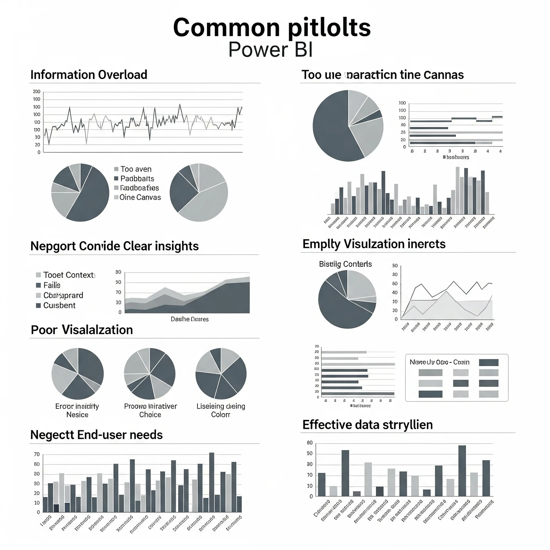
One of the most frequent mistakes is information overload. We believe that the more data we show, the better. False! A saturated dashboard creates noise, not clarity. It’s like trying to listen to a song in the middle of an out-of-tune orchestra. The key is simplicity and focus. Each visualization must have a clear purpose and contribute to the overall narrative. Ask yourselves: Does this chart help the user better understand the main objective of the dashboard? If the answer is not a resounding yes, it should probably go.
Another common stumble is the lack of context. Numbers alone are just numbers. They need a frame of reference. Is a value high or low? How does it compare to the previous month, last year, or a pre-established goal? Without context, a number is useless. For example, showing “Sales: $1,000,000” is less valuable than “Sales: $1,000,000 (15% above target and 10% more than the previous month).” Use Key Performance Indicators (KPIs) with clear comparisons and visual cues (colors, arrows) to indicate performance.
The poor choice of visualizations is also a major hindrance. Not all charts serve the same purpose. A pie chart is terrible for comparing many categories, while a bar chart is excellent for it. If you want to show trends over time, a line chart is your best ally. Using the wrong type of chart is like trying to hammer a nail with a screwdriver: inefficient and frustrating. Take the time to understand what type of visualization is most suitable for each type of data and business question you want to answer.
Finally, and perhaps the most critical mistake, is forgetting the end user. Who are you building this dashboard for? What are their business questions? What decisions do they need to make? A dashboard designed for a CEO will be very different from one for a sales manager or a marketing analyst. The user experience (UX) is fundamental. Make sure the navigation is intuitive, the filters work correctly, and the information is easily accessible. Conduct tests with end users and gather their feedback. A dashboard that is not used, no matter how technically perfect it is, generates no value.
In my experience, the companies that truly get the most out of Power BI are those that invest time in strategic planning before opening the software. Define clear objectives, relevant KPIs, and, above all, understand the needs of your users. Power BI is not just a tool; it is a catalyst for business intelligence. By avoiding these mistakes, you will not only create dashboards; you will build true decision centers that will drive the growth and efficiency of your organization.
Are your Power BI dashboards truly driving action, or just accumulating data? It’s time to review them with a critical and strategic eye.